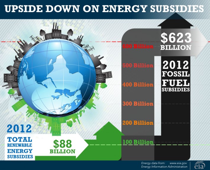
Social media use is going through explosive growth. While we can’t predict which channels will be the best ones for your company, we have observed that images, especially infographics that relate to your company’s business, is one way to enhance the ongoing conversation with your customers.
Detailed infographics can cost thousands to develop, but simpler ones can be a part of your social media on a regular basis. Wondering what goes into an infographic?
- Start by researching trends or data related to your industry; in the above example, we gathered data from a government source to obtain accurate information.
- Yes, accurate information is essential!
- Once your data is organized, decide how best to present the data visually: would a bar graph be ideal? Or, what about a pie chart?
- The best infographics convey the big picture at a glance!
Tips:
- Pie charts are best to compare percentages to the whole, and for categories that are less than 5% of the total, it may be best to group as “Other”.
- Line charts can effectively show fluctuations over time (see example below)
- Yes, you can combine more than one type of chart in an infographic; the rule is to keep thing visually simple so the most important facts can be understood in a glance.


