How do you create a custom PowerPoint template that looks good, and helps your client create effective presentations? Keep reading for tips and best practices for constructing templates that work as expected, and avoid PowerPoint pitfalls.
Most designers dislike PowerPoint because of its irritating design limitations. But, most companies use tools such as Word and PowerPoint on a daily basis for reports, presentations, white papers, and other documents meant to be emailed to their prospects and/or customers. So for your client companies, it’s important to develop Office templates that extend their branding into the tools used for creating everyday communication.
Therefore, you have to embrace the design limitations of PowerPoint, and plan accordingly. Below are some considerations for designing PowerPoint slide layouts:
- You will need to design to a landscape (horizontal) orientation; find out whether the client needs a widescreen (16:9) and/or a 4:3 version before getting started with design. Depending on the world region(s) in which they will give presentations, they may need both.
- Find out what types of information will routinely be needed and develop slide master layouts accordingly. This will help your client keep presentations looking consistent.
- Example: does your client need a “Team” slide with placeholders for staff photos, with department and title below?
- Does your client use the pre-built SmartArt diagrams and charts already available in PowerPoint? Consider creating slide layouts that will better showcase these elements to tell the story.
- When developing the color scheme, consider whether there will be sufficient contrast for elements to be legible viewed from a distance. This leads directly to the next point…
- Keep it simple: less is more when it comes to presentations. Effective presentations showcase one primary point per slide. Simple layouts will also be easier for non-designers to maintain.
- When developing layouts for client approval, it’s fine to use a tool such as InDesign.Tip: To ensure that all content on the slides is visible when presented, set up your InDesign document with a page size of 10″ width and 5.63″ height for 16:9 presentations. For 4:3 presentations the page size should be 10″ width by 7.5″ height. Note: for clients that will use only very large screens for presentations, a document size of 13.33″ width and 7.5″ inches in height is ideal for 16:9 presentations. Margins should be .5 inch; top and bottom margins can vary but .25 inch is a minimum, and only footer text such as disclosure/copyright, date and slide number should be outside of a .5 inch margin at bottom.
- Keep in mind that most clients will need to stick with typefaces that are system fonts. Use a system font that makes visual sense with your client’s brand from the start.
- For layouts, think in terms of one-column, two-column, and a maximum of three-columns. Three-column grids are also ideal for layouts with a one-third width column of text left or right and an image or chart that fits the remaining two-thirds of the slide width.
- Object positioning in PowerPoint is not as precise as in design software. In other words, an object placed at 1.125″ from an edge in InDesign is going to be at 1.13″ in PowerPoint. Design accordingly!
- Use high quality images: we strongly recommend to clients that they license quality stock images and/or schedule a photoshoot. Low quality images look worse when projected onto a large screen.
Tip: Before developing layouts using a design application, take a look at some of the pre-built templates that come with the application to see how the developers of PowerPoint approach various design elements. This step will help you avoid design that cannot easily be replicated in PowerPoint.
Once you have client sign off on the layouts, you are ready to construct the PowerPoint template.
There is a best practice:
first create a Theme,
then apply that theme to a Master,
then build Master Slide Layouts.
Last, add Slides that use the layouts you just built.
What is a PowerPoint Theme?
A theme includes the color palette for text, slide background colors and the default colors of charts or diagrams. Themes also include the fonts to be used in the presentation. PowerPoint has built-in color themes that you can customize. You will find the Colors in Slide Master view. From the application menu, View > Master > Slide Master. Then click Colors to customize them for your client.
Tip: remember to save your custom colors with a name that is more specific than the default “Custom 1” name.
You can also save effects such as drop shadows or glossy effects. Once saved, these effects will become the default effect for all shapes that are inserted into a presentation that uses your theme, so use effects sparingly or not at all!
Tip: first create a custom color palette and select fonts for the theme before adding any shapes or text boxes, because added text placeholders and/or shapes will automatically use the colors and fonts you just specified.
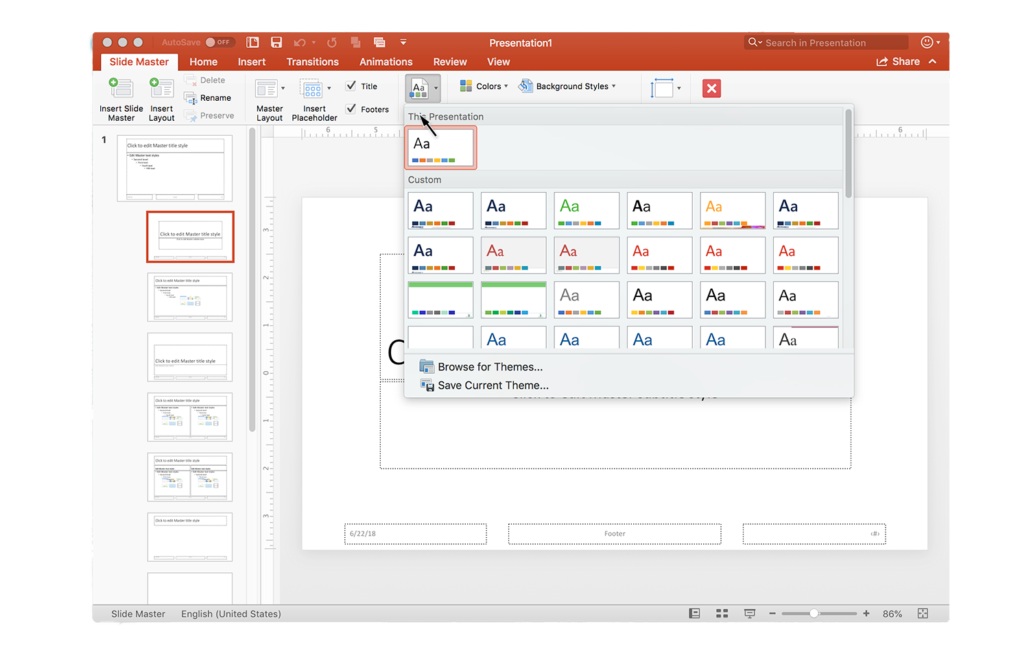
You will want to save the changes you made to the default colors, fonts and effects as a theme (.thmx file) so that you can apply the same look to other presentations. Make sure you are in Slide Master view once you’re done making changes. Then, on the Slide Master tab, select Themes and click Save Current Theme.

The link to “Save Current Theme” is at the bottom of the pop-up window, indicated above with the cursor arrow.
In the file name dialog box, type a name that will help you find this theme easily, and click Save. The next time you open PowerPoint, this theme will be added to the list of custom themes on the Design tab of the ribbon.
Details here: https://support.office.com/en-us/article/use-or-create-themes-in-powerpoint-83e68627-2c17-454a-9fd8-62deb81951a6
Once you have created a theme, building the template is next.
What is a PowerPoint Template?
A PowerPoint template (.potx file) is a set of slide layouts; it serves as a pattern or blueprint for creating a presentation. PowerPoint has built-in templates that you could customize but for maximum flexibility, you will want to start with a blank presentation.
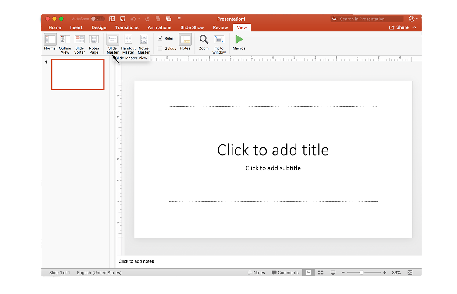
Open a blank presentation, select the View tab on the ribbon, then choose Slide Master in the Master Views group.

Select the “View” tab on the ribbon, then select “Slide Master”
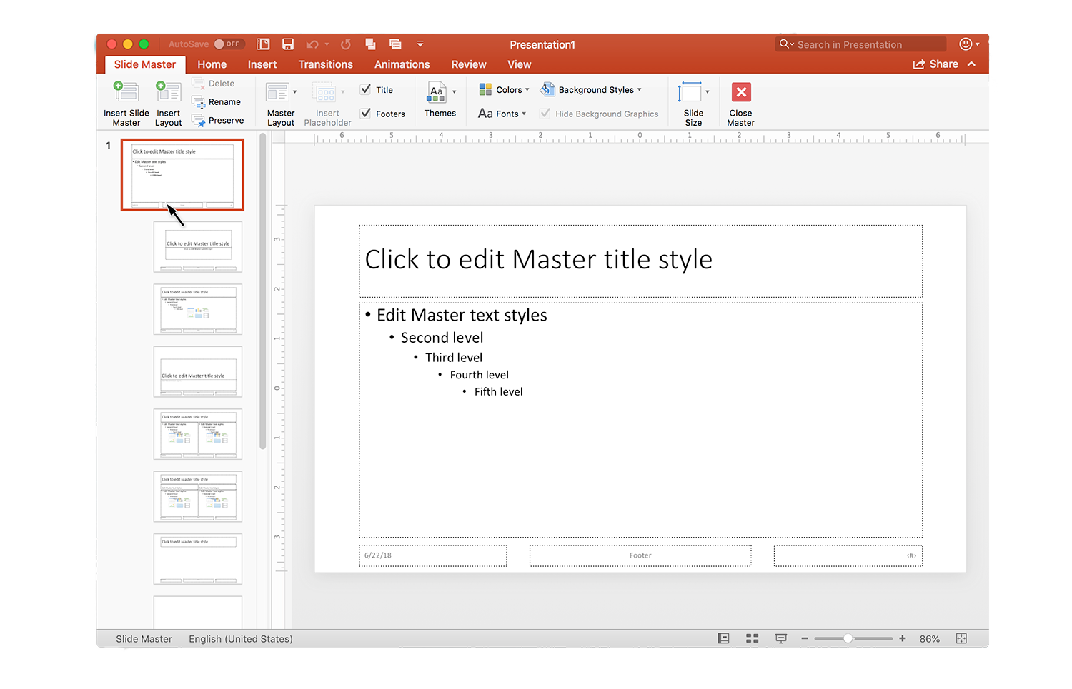
The slide master is the largest slide at the top of the thumbnail list at left of your window. Associated slide layouts are below the slide master.

In Slide Master View, the top-level master is the large slide thumbnail at the top of its associated slide layouts.
You will want to apply the theme you just saved. To find the theme, click the Themes button and scroll to find your new theme in the Custom section. Tip: if you hover your mouse over the thumbnails in this list, the theme name appears. Click the thumbnail for the theme you want to apply.

If you created a Custom theme, you may need to scroll down the pop up window to find the new theme (they are listed in alphabetical order)
Now it’s time to customize the basic layouts contained in the blank theme.
First modify items that will be present on all of the slides: set the appearance and position of elements such as the title, the main content area, body fonts and the appearance of lists on the top-level Master slide. Customizations made on this top-level Master will carry through all of the other associated Master Slide Layouts.
- You may also want to modify the appearance of elements in the footer, such as the slide number, and date.
- If you need to include a copyright statement or other disclaimer that can go in the text box labeled “Footer” in the screenshot above.
- These footer area text boxes do not have to remain where they are; you can move them as wanted.
Remember to save your file regularly.
Once you are finished with modifications to the top-level Master, then make changes to the other associated layouts.
- It’s a good idea to keep titles and a primary content/text box in the same position throughout the Master Layouts, except on the cover slide, the closing slide and section divider slide layouts. With this approach, the title and most prominent text content won’t seem to “jump around” as slides are presented.
- If you do not want to have the footer information on a cover slide or any other Master Layout, simply uncheck the box beside “Footers” in the ribbon on the “Slide Master” tab.
Once you have finished modifying the slide layouts and/or adding new Master Slide Layouts and customizing them it’s time to save your template. Once you have saved the template, you can test how things are working by creating a new presentation based on that template.

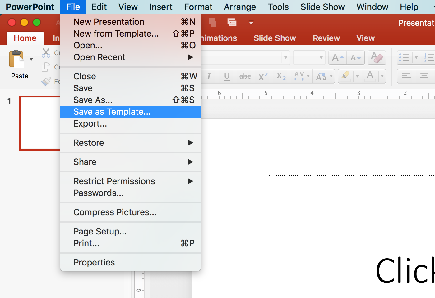
After you are finished modifying all the layouts, remember to save your presentation as a template.
PowerPoint will save that template in the default location on your computer unless you specify another location. It’s best to allow PowerPoint to save the template in the default location so the template is available on the launch screen when you want to start a new presentation.

PowerPoint has “Featured” (i.e. their pre-built templates), and “Personal” tabs. When you create a new template it will be listed under the personal tab.
If you do not see your new template listed in PowerPoint’s launch screen options, close PowerPoint and then reopen it. Your new template will be listed in alphabetical order, and may be under the “Personal” list rather than PowerPoint’s “Featured” list.

